

As an active member of Krav Maga Center Luxembourg, I not only participated in various activities but also relied on the dojo’s website to stay updated on news, events, schedules, and new programs. However, I encountered difficulties in finding information on the website and was overwhelmed by the sheer amount of content and its presentation. Determined to address this issue, I reached out to the dojo owner. After conducting a series of in-house interviews, it became apparent that my concerns were shared by other dojo members. Some expressed their frustration, stating, “Each web page looks different; I’m unsure if I’m still on the Krav Maga site or if I’ve been redirected.” Another member mentioned having to resort to checking the updated schedule on Facebook due to website navigation challenges. Others pointed out issues such as excessive text with small font size and the website’s lack of mobile-friendliness.
Solution
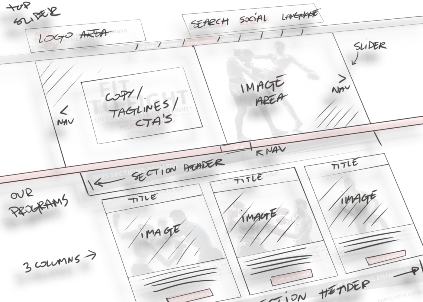
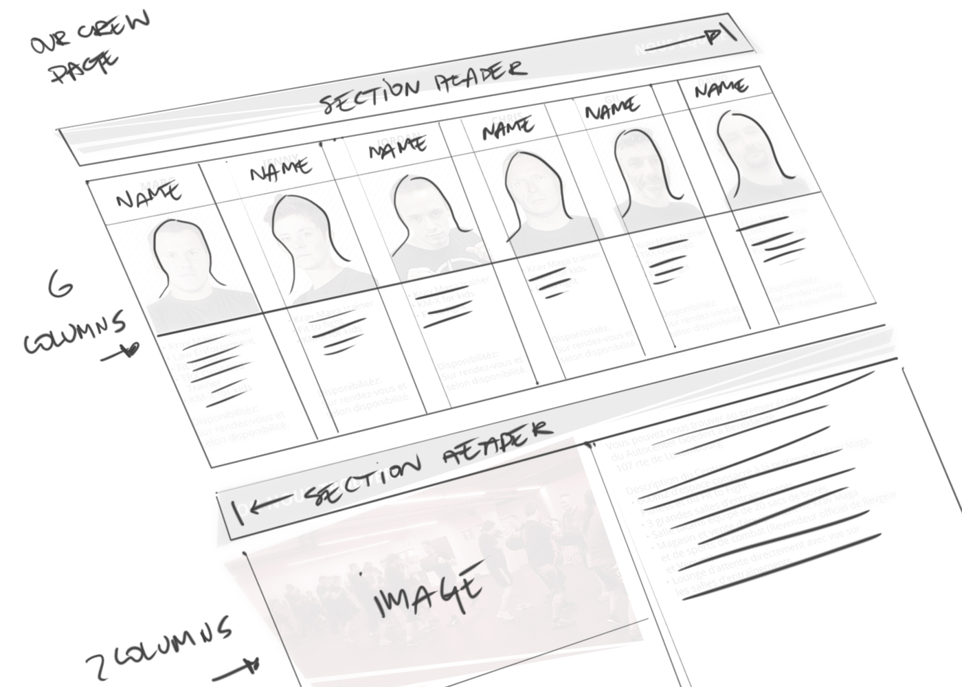
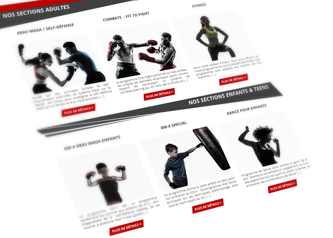
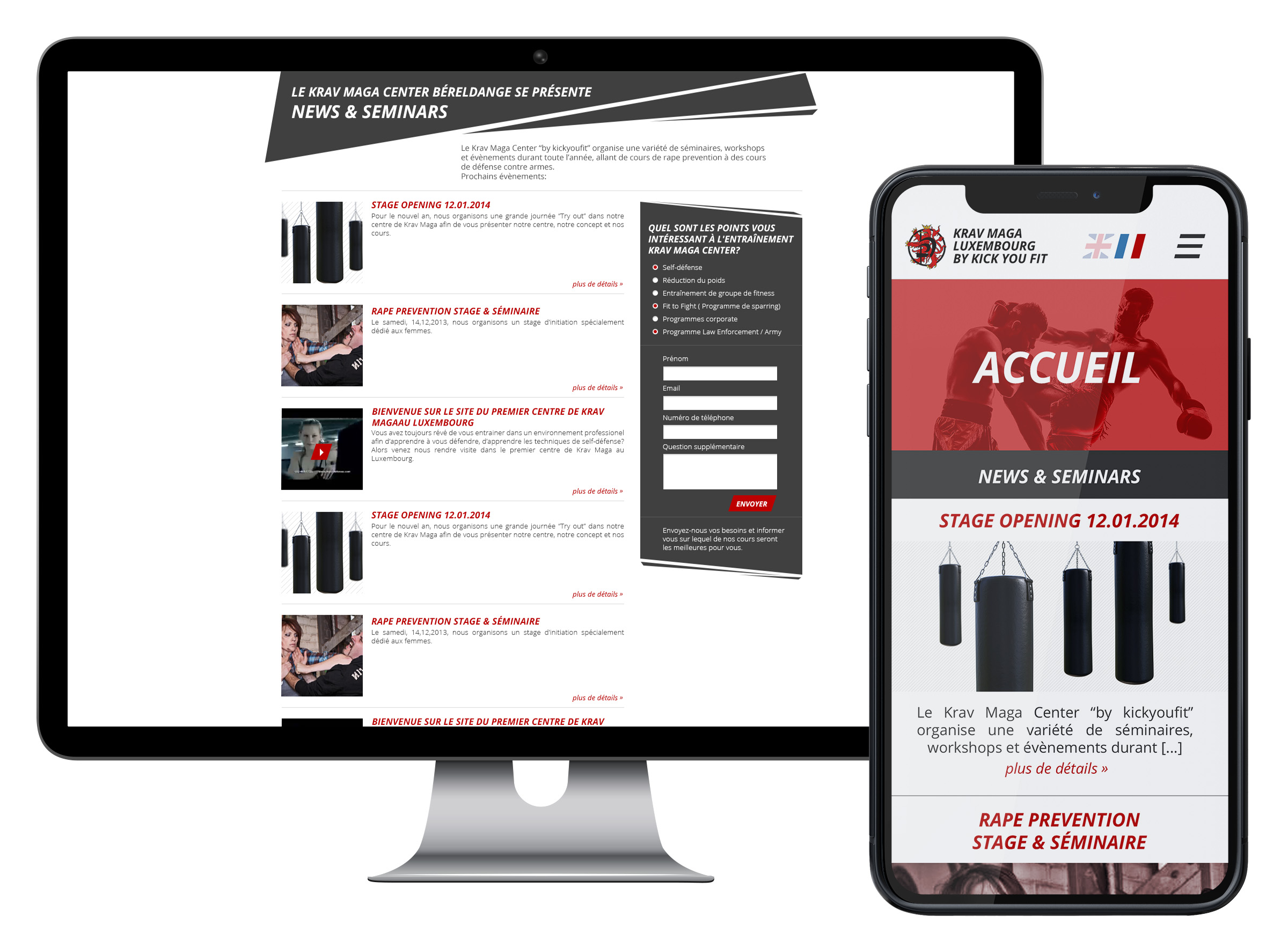
The results of our UX research underscored the need for significant improvements to the website’s information architecture, UI redesign, and responsiveness. The visual consistency across the website must be enhanced to provide a seamless user experience. Additionally, the abundance of information on the site should be either reduced or restructured in a more logical manner, aligning with the needs of both users and the dojo owner.
Client
Krav Maga Center Luxembourg
Services
- Web Design
- Wireframing
- Site Architecture
- UI/UX Design
- Art Direction
Color Palette
I chose to integrate the colors of Krav Maga Center into the website’s color palette. This initial step aims to establish a cohesive and unified brand image.
Black
R:0 G:0 B:0
C:75 M:68 Y:67 K:90
HEX: 000000
Graphite Gray
R:64 G:64 B:64
C:68 M:61 Y:60 K:47
HEX: 404040
Bloody Red
R:188 G:0 B:0
C:18 M:100 Y:100 K:10
HEX: bc0000
White
R:255 G:255 B:255
C:0 M:0 Y:0 K:0
HEX: ffffff
Typography
I chose to incorporate the Open Sans font family for its simple form, aiming to reduce cognitive load. The use of italic style for UI elements and headings adds dynamism to the overall look and feel of the website.
Open Sans Family
Bold Italic
Aa
A B C D E F G H I J K L M N O P Q R S T U V W X Y Z
a b c d e f g h i j k l m n o p q r s t u v w x y z
Light Italic
Aa
A B C D E F G H I J K L M N O P Q R S T U V W X Y Z
a b c d e f g h i j k l m n o p q r s t u v w x y z
Light Regular
Aa
A B C D E F G H I J K L M N O P Q R S T U V W X Y Z
a b c d e f g h i j k l m n o p q r s t u v w x y z
Process
At every stage of the creation process, from defining the color palette and selecting fonts to outlining the layout through wireframes, building UI components, low fidelity prototypes and choosing photography, we engaged in consultations with the client. This collaborative approach ensured that the designed solutions not only addressed user problems but also aligned with the business needs. Together, we worked to define and complement the character and style of the website, aiming for a consistent visual experience that users can easily identify with.


Results
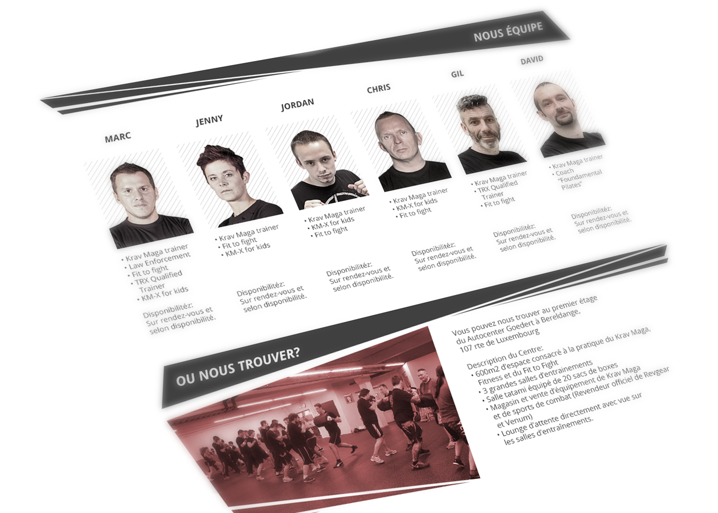
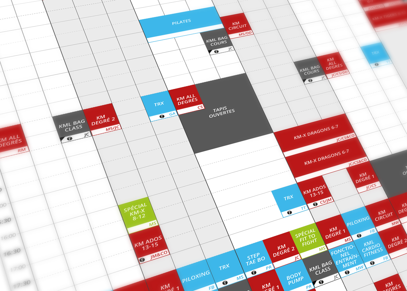
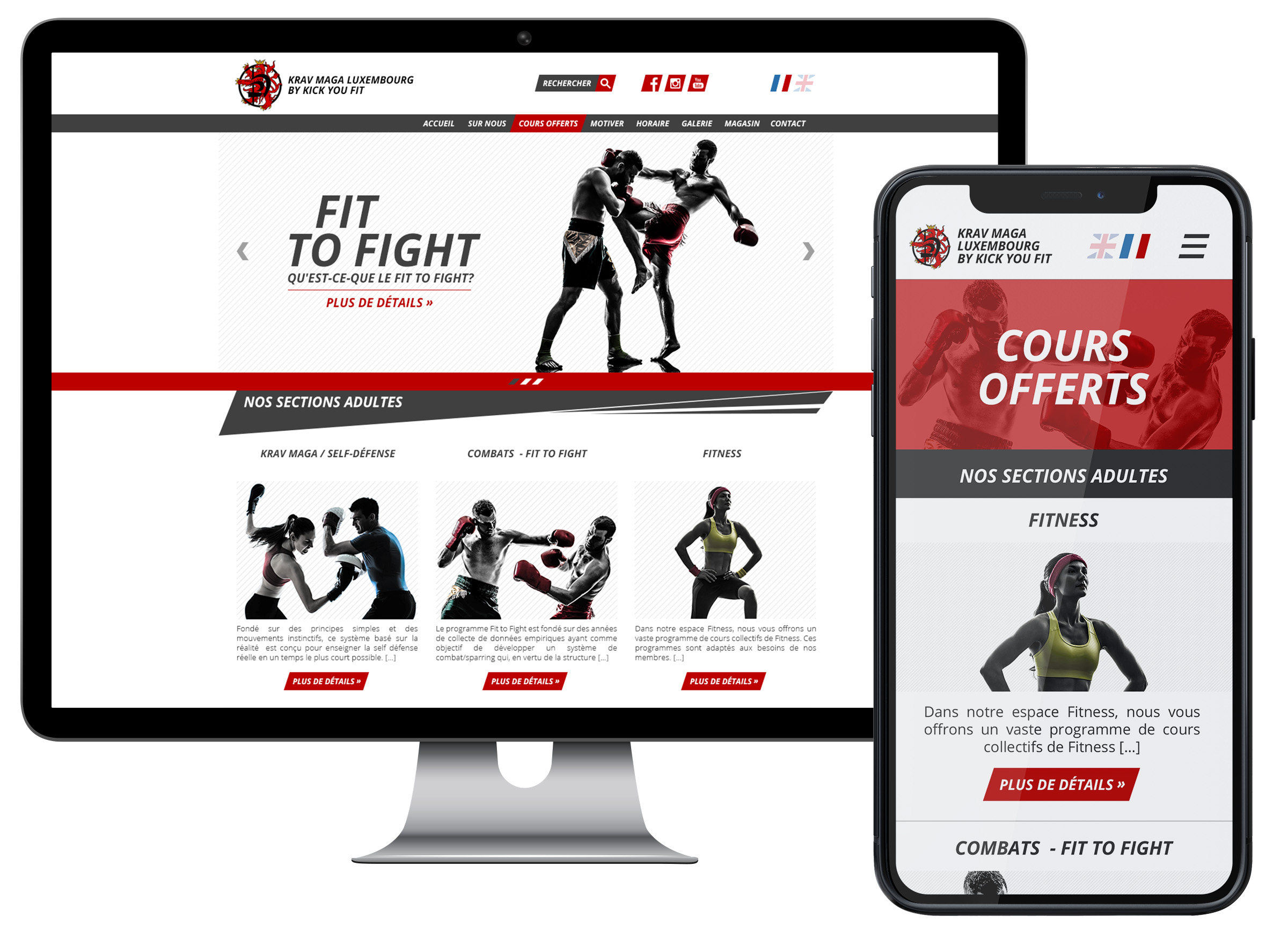
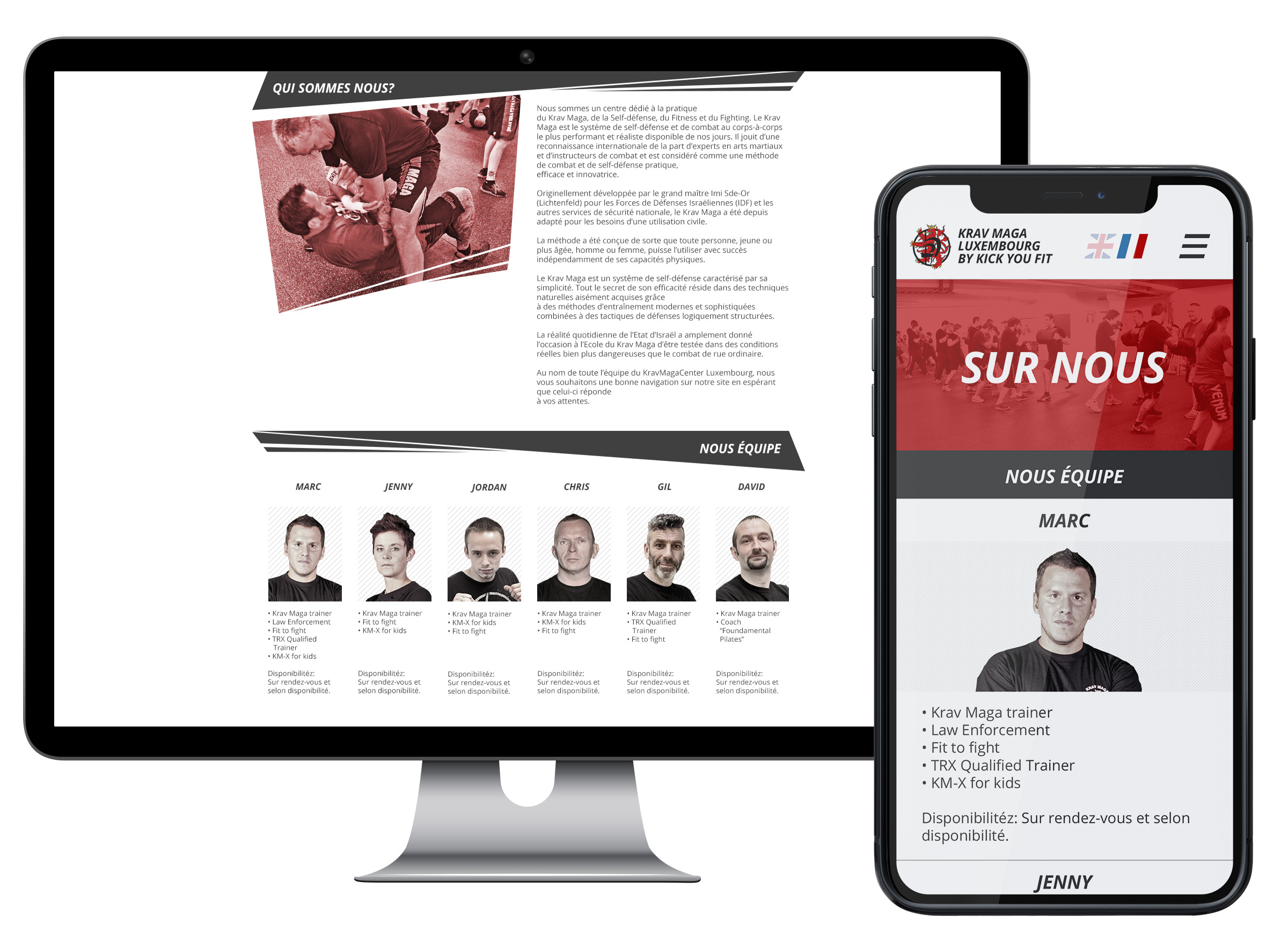
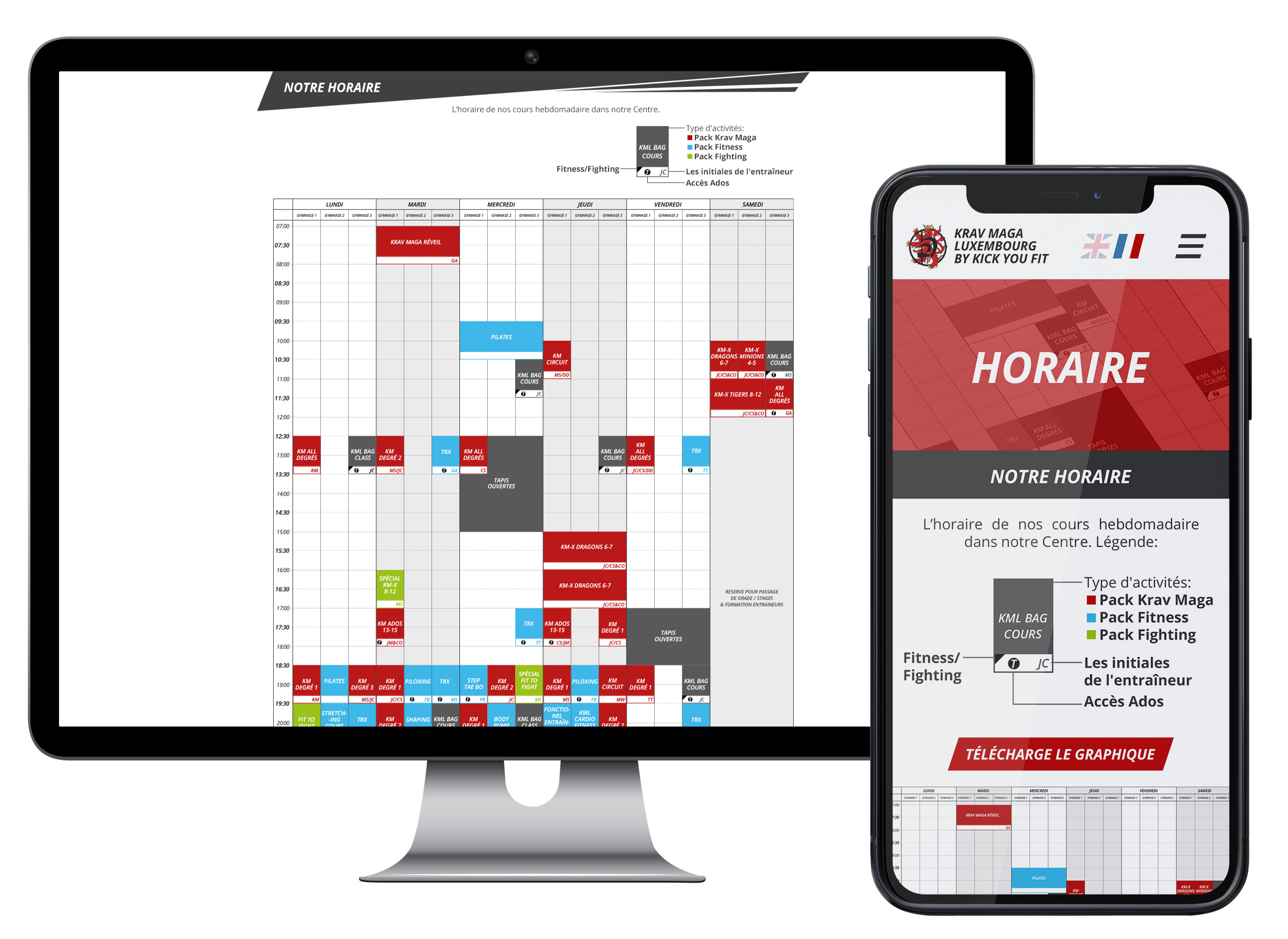
Through a collaborative process involving users, clients, and developers, we successfully delivered a fully responsive website with a refined and consistent design. The presentation of information is clear and structured, supported by a user-friendly Content Management System (CMS) for easy updates. The activities timetable received a new design visual system, ensuring easy preview across all platforms and facilitating convenient downloads.


